Linux Font Rendering Stinks

2009-10-05 10:32 - Linux

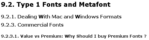
In my continuing series of Linux rants, here I go on about fonts. Font rendering in Linux is horrible. It makes things especially difficult to read, or simply unpleasant to look at. For my first example:

The above image is a screenshot of the Optimal Use of Fonts on Linux guide, with the default font set to Verdana (one of the suggestions this guide makes). I've gone through it, and attempted to do what it says. But I still see issues like this: sometimes certain letters will become "bold" in the middle of a sentence, for no good reason. I know there's no markup in that HTML page that should make it show up bold, it's just some rendering engine that has a fault. Both the uppercase W and V letters look really wrong. It doesn't seem to handle those slanted lines well. (You can see a bit of the same in the M and y letters, and a teeny bit in the s, too.) Leaving Firefox at the default settings is a bit better — but probably just because Verdana isn't very heavily used, so I haven't seen it broken.

But there's much worse:

In Windows:

In Linux:

Both of the above screenshots come from an online article, which isn't important, except that this one seems to make use of one of the worst offenders: Helvetica. First, a very common complaint I have: Linux seems to screw up the kerning. See how especially the "e" is skewed to the left, also the "o", such that these letters are mashed up touching the pervious, with empty space to the right. Take a look at "delete" on the second line. The same goes for "That" a few times towards the end of the first paragraph: on Linux, it's all jumbly. It's also, overall, noticeably smaller than the same font on Windows. Result? The Windows screenshot is pleasant, the Linux one hard to read, even comparing screenshots on the same screen. (I suspect a high DPI on the monitor I have at work exacerbates some of my font-too-small issues, but the screenshots both on this screen show Windows results look better, on it.)

This even after doing everything I could to improve the situation. Installing the msttcorefonts (Microsoft Fonts) seems to have helped a few things (especially Arial, I believe). But plenty still looks bad.

Comments:

It's not the font rendering, it's the default setup
2009-10-06 02:15 - Matthieu Weber

The screenshot of the Windows rendering shows that subpixel antialiasing is activated (there's a colorful glow around the pixels), whereas in the Linux rendering it is not (it's only greylevels). Moreover, the font actually used in Windows and Linux for rendering "Helvetica" is not the same: In Windows, it's probably Arial, whereas in Linux it's maybe Nimbus Sans, which is not a font optimized for low-resolution, on-screen rendering, but rather for printing. If you want better on-screen rendering, use a font which is optimized for that purpose (such as the DejaVu family, or the Microsoft core fonts), and activate subpixel rendering. Yet another solution would be to use bitmap fonts for Helvetica in small sizes (9-16 pt) and something else for larger sizes. Bitmap fonts are perfect for on-screen display, with no need to antialias, but are limited to a few sizes. Unfortunately, at least in Firefox 3.5, printed web pages will look very ugly if you configure the browser to use bitmap Helvetica, and I found no way to tell it to use a replacement vector fonts for printing.

Not default!
2009-10-06 09:23 - arantius

As I said, I've done everything I can to tweak the fonts. System>Preferences>Appearance>Fonts has "Subpixel smoothing" selected. I'm even pretty sure it's visible in that picture, but barely, because it's (font size) so small. I don't have Helvetica on either machine, so you're right, it's probably picking something else. Or the other fonts listed in the CSS rule. But it's that CSS specifying the font, I don't have any control over what it says. Nor do I want to spend time picking replacements for every font someone might ever list in a web page. Nor do I want to deal with the endless variety of brokenness that pages display, when you force some other font (that will be a slightly different size) in place of what the designer intended. On Windows, it pretty much always looks good enough to be readable.

This is "known"?
2009-10-08 10:09 - arantius

I keep running into this, and it's very annoying. It's apparently "known" but, is there a fix?

Not that it helps at all. Some fonts are just known to look bad on Linux, and there seems to be little to no progress about it.

Is it fixed?!
2009-10-09 10:12 - arantius

Just found this page whose CSS says font-family: "Trebuchet MS",Helvetica,sans-serif, which I have no practical control over. At first, it looked like this:

Windows on top, Linux on the bottom. Linux has the crazy bolded-diagonal-lines on the capital M, some strange kerning issues (look at "each"), and the lowercase "o" is really out of whack. But then! (I think this is what did it..) I read through, and applied, the stuff in Ubuntu, Font Hinting, & You: A Cautionary Tale. I actually ended up with a fonts.conf of:

<?xml version="1.0" ?>
<!DOCTYPE fontconfig SYSTEM "fonts.dtd">
<fontconfig>
    <match target="font">
        <edit name="antialias" mode="assign"><bool>true</bool></edit>

        <!--
        <edit name="autohint" mode="assign"><bool>false</bool></edit>
        <edit name="hinting" mode="assign"><bool>false</bool></edit>
        <edit name="hintstyle" mode="assign"><const>hintnone</const></edit>
        -->
        <edit name="autohint" mode="assign"><bool>true</bool></edit>
        <edit name="hinting" mode="assign"><bool>true</bool></edit>
        <edit name="hintstyle" mode="assign"><const>hintslight</const></edit>

        <edit name="rgba" mode="assign"><const>none</const></edit>
        <!-- <edit name="rgba" mode="assign"><const>rgb</const></edit> -->
    </match>
</fontconfig>

As you can see, I'm not sure if I really want to take the no hinting advice (yet), but with this in place, the above becomes:

Much better! I've checked the effect on Verdana and the other link mentioned in the original article, and it seems to be equally helpful. This problem might just be fixed!

More Verdana Craziness
2009-10-13 11:24 - arantius

I found more issues, in the Django documentation. Guess what font their CSS specifies?

Various letters here are showing at very wrong sizes. The main headers have certain letters (s, n, g, o, w, etc) showing at a smaller size. The w in the smaller header (New in Django 1.1) is showing at the same wrong size, but here it is too big. Zooming in or out one level makes it go away. Using a different font (fudging the css w/ Firebug) makes it go away. This page is still one of the many that just looks wrong unless I go to specific effort to fix it, though. And that stinks.

Why do you use linux then?
2009-10-29 08:35 - monkinsane

Why not just stick to windows - it would seem you'd be much happier if you do.

you are right
2009-11-23 05:12 - acro

in a month or two, I will definitely go back to windows

Which distro are you using?
2009-11-30 15:55 - leviz

I've been using Kubuntu for a couple years now and font rendering is excellent. I prefer to use Verdana.

Here are my settings: force font DPI to 96 anti-aliasing enabled I didn't enable any sub-pixel hinting

They look just as good as the fonts on my windows computer at work. I tried Suse a while back and font rendering was awful... nothing I tried could fix it. Every Linux distro is a different.

This problem is very specific to Firefox under Linux
2010-01-22 22:48 - jenningsthecat

I've gone to a LOT of trouble to get fonts in Gnome to look as good as I'm used to having in Windows. (I use medium hinting, but no smoothing, as the 'colorful glow' mentioned by an earlier poster just makes text look blurry and hard-to-read. And I use Microsoft fonts). But Firefox is the last holdout on my Debian/Gnome system when it comes to crappy-looking text. I have web pages looking OK now, but only by having configured Firefox to use fonts that I specify rather than what the web page was written for. So I now get clear, readable text, but often it's not the font that the web page was designed to use.

I say this problem is very specific to Firefox under Linux, because Opera's font rendering is fine under Linux, and Firefox's font rendering is fine under Windows. (If Opera had lots of useful addons and an interface that didn't make me want to tear my hair out, I'd switch browsers and be done).

If Firefox can get it right under Windows, and Opera can get it right under Linux, why can't Firefox get it right under Linux?

Post a comment:

Username
Password
  If you do not have an account to log in to yet, register your own account. You will not enter any personal info and need not supply an email address.
Subject:
Comment:

You may use Markdown syntax in the comment, but no HTML. Hints:

If you are attempting to contact me, ask me a question, etc, please send me a message through the contact form rather than posting a comment here. Thank you. (If you post a comment anyway when it should be a message to me, I'll probably just delete your comment. I don't like clutter.)